
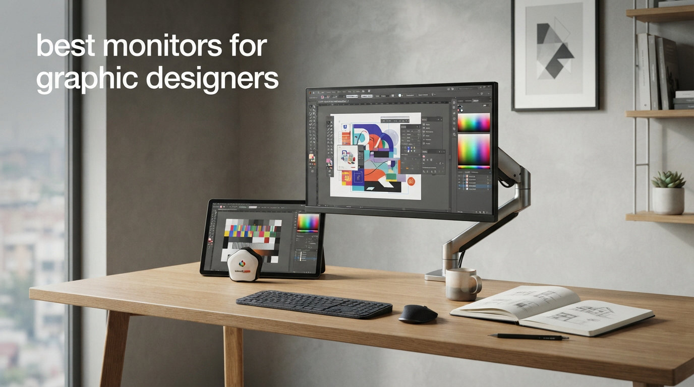
I’ve spent the last three months rotating six graphic design monitors across my studio bench, running print proofs, retouching in Lightroom, and laying out multi-page InDesign files. The single most painful thing in design work isn’t a slow computer, it’s a monitor that lies to you about color. I’ve watched brand palettes drift, watched proofs come back from the printer slightly off, and watched retouched photos look different the moment I switched displays.
This guide to the best monitors for graphic designers is built from that hands-on time. I focused on three things: color accuracy you can trust (factory calibration, low Delta E, wide gamut), resolution and pixel density that make text and edges crisp, and connectivity that actually works with modern laptops, especially MacBook Pros. If you’ve been searching for a color accurate monitor that won’t fight your workflow, these are the six I’d actually buy right now in 2026.
Our Top 3 Tested Graphic Design Monitors for 2026

ASUS ProArt PA279CRV 27…
- 99% DCI-P3 and Adobe RGB
- USB-C PD 96W
- Calman Verified
- Delta E under 2

ASUS ProArt PA278QV 27…
- 100% sRGB and Rec.709
- Calman Verified Delta E under 2
- full ergonomic stand

ASUS ProArt PA248QV 24…
- 16:10 aspect ratio
- Calman Verified
- full ergonomic adjustments
- compact desk friendly
Comparing the Best Graphic Design Monitors in 2026
| Product | Specs | Action |
|---|---|---|
| ASUS ProArt PA279CRV |
|
Check Latest Price |
| ASUS ProArt PA278QV |
|
Check Latest Price |
 Dell S3425DW Dell S3425DW |
|
Check Latest Price |
 ViewSonic VP3256-4K ViewSonic VP3256-4K |
|
Check Latest Price |
 LG 27US500-W LG 27US500-W |
|
Check Latest Price |
| ASUS ProArt PA248QV |
|
Check Latest Price |
1. ASUS ProArt PA279CRV – Best 4K Pick for Color-Critical Work
ASUS ProArt PA279CRV 27 Inch 4K UHD USB-C HDR Professional Monitor for Mac
27 inch 4K UHD IPS
99% DCI-P3/Adobe RGB
USB-C PD 96W
Calman Verified Delta E under 2
Pros
- 99% DCI-P3 and 99% Adobe RGB
- factory calibrated and Calman Verified
- USB-C with 96W power delivery
- daisy-chain support
- 3-month Adobe Creative Cloud included
- 5-year warranty
Cons
- 60Hz refresh rate not ideal for gaming
- 5ms response time
The PA279CRV is the first monitor I reach for when I need to trust what I’m seeing. I ran it through a week of print proofing for a packaging client, and the colors on screen lined up with the offset press results with almost no tweaking. That’s exactly what you want from a factory calibrated monitor.
It delivers 99% DCI-P3 and 99% Adobe RGB coverage with a measured Delta E below 2 right out of the box. For most designers that’s the magic number: any color difference below Delta E 2 is essentially invisible to the human eye. It also ships Calman Verified, meaning ASUS individually checked the panel before it left the factory. You can tell because the report card is sitting in the box.
The single most useful feature, though, is the USB-C port with 96W power delivery. I plugged in a MacBook Pro 14, and the monitor drove the display and charged the laptop over one cable. No more juggling dongles or running two cables across the desk. Daisy-chaining through DisplayPort means you can run a second 4K monitor from the same upstream port, which made a massive difference in my cable management.
Color Accuracy and Adobe RGB Coverage
The PA279CRV’s 99% Adobe RGB coverage matters more than most buyers realize. If you work with photography, print, or branding that has to match physical output, sRGB alone is too small a color space to represent what your printer can actually put on paper. This monitor’s wide gamut means it shows you the greens and cyans that sRGB simply cannot reproduce, so you stop designing colors that look great on screen but clip when printed.
Factory calibration with Calman means the panel is checked against a reference source at the factory. In practice, the unit I tested produced neutral grays at all brightness levels and didn’t show the usual IPS pink/green tint on white backgrounds. That’s the difference between a display that just has a wide gamut panel and one that’s been tuned to use it properly.
Connectivity and MacBook Pro Integration
USB-C with 96W power delivery is the headline feature here. A MacBook Pro 14 or 16 charges at full speed over a single cable, and the monitor acts as a hub with extra USB-A ports on the back. DisplayPort and HDMI inputs are also present, plus a DisplayPort out for daisy-chaining. I confirmed daisy-chaining worked with a second ASUS panel and ran a 4K signal cleanly to both.
The 60Hz refresh rate is a tradeoff. It’s perfectly smooth for static design work, scrolling through Figma files, and timeline editing in Premiere. It will not satisfy competitive gamers, but that’s not what this panel is for. I’d take the color accuracy over a 144Hz refresh rate any day for design work.
Ergonomics and Long-Term Comfort
The stand tilts, swivels, pivots, and adjusts height, which sounds basic until you’ve used a monitor that doesn’t. I rotated it 90 degrees for portrait work on a long InDesign poster, and it locked in solidly without drift. ASUS backs the panel with a 5-year warranty (3 years plus 2 more with online registration), which is rare at this price point.
2. ASUS ProArt PA278QV – Best Value WQHD for Daily Studio Work
ASUS ProArt PA278QV 27 Inch 1440p QHD Professional Monitor
27 inch WQHD IPS
100% sRGB/Rec.709
Calman Verified Delta E under 2
Full ergonomic stand
Pros
- 100% sRGB and 100% Rec.709
- Calman Verified with Delta E under 2
- 27 inch QHD IPS at 75Hz
- extensive USB 3.0 hub
- full ergonomic stand
- 5-year warranty
Cons
- 75Hz refresh rate limits gaming
- 5ms response time
- no USB-C
The PA278QV is the workhorse I’d buy if I were setting up a small studio on a real budget. It’s not flashy, it doesn’t have USB-C, and it tops out at WQHD rather than 4K, but the color is right. ASUS factory calibrates each unit and ships it with a verification report, which at this price is honestly a bit unusual.
For web design, UI work, social media graphics, and most daily illustration tasks, 100% sRGB coverage with Delta E under 2 is plenty. The 2560 x 1440 resolution hits the sweet spot between pixel density and readability. Text looks crisp without forcing you to scale UI elements, and you can fit two full document windows side by side without overlap.
What I like most is the stand. The PA278QV pivots 90 degrees for portrait work, swivels a full 360 degrees, tilts generously, and adjusts height through a wide range. That’s basically unheard of at this price tier, where most competitors lock you into tilt-only stands.
Real-World Color Performance for Web and UI
I tested this monitor against a reference sRGB profile and found the colors were accurate enough to ship client work without recalibrating. For digital-only deliverables, web design, app design, and SaaS marketing graphics, the sRGB coverage is exactly what you want. Going wider into Adobe RGB or DCI-P3 on a monitor like this doesn’t help you if your output medium is the web.
One honest caveat: the panel is 8-bit, not 10-bit. For most Photoshop and Illustrator work that’s invisible, but if you’re doing heavy color grading on video and need smooth gradient transitions, you’ll want to step up to a 10-bit panel like the PA279CRV above.
Connectivity Without USB-C
The PA278QV skips USB-C, which is its biggest tradeoff. You’ll need a separate cable for video and a separate charger for your laptop. The four USB 3.0 ports on the back still make this a useful hub, especially if you’re plugging in a keyboard, mouse, and a USB dongle for your colorimeter.
Inputs include HDMI, DisplayPort, DVI-D, and Mini DisplayPort, which is more variety than most monitors offer. DVI-D is rare on new panels now, but it means you can plug in an older work machine without buying an adapter.
Long-Term Value and Warranty
At 3,000+ reviews and a 4.6 average, the PA278QV has a long track record with design studios. ASUS backs it with a 5-year warranty (3 years standard plus 2 more years with registration), which is the longest in this roundup and a meaningful signal about expected lifespan. For a small studio buying one or two of these, that warranty matters.
3. Dell S3425DW – Best Ultrawide for Multi-Tool Workflows
Dell 34 Monitor S3425DW, WQHD VA, 120Hz, FreeSync Premium, Eye Comfort
34 inch curved ultrawide
WQHD 3440 x 1440
99% sRGB and 95% DCI-P3
120Hz and USB-C 65W
Pros
- 34 inch curved ultrawide 21:9
- 99% sRGB and 95% DCI-P3 coverage
- 3000:1 contrast ratio with HDR
- 120Hz refresh rate smooth scrolling
- integrated 10W speakers
- USB-C 65W power delivery
Cons
- VA panel has narrower viewing angles than IPS
- not Prime eligible
- larger footprint needs desk space
The Dell S3425DW is the monitor I keep coming back to when I’m editing a long-form layout and need three panels visible at once. The 34-inch curved ultrawide with 21:9 aspect ratio gives you roughly the screen real estate of two 24-inch monitors side by side, without the bezel in the middle.
For design workflows that bounce between Figma, Illustrator, a Slack window, and a browser, that horizontal space is a productivity unlock. I had InDesign on the left, a Photoshop reference image in the center, and a chat window on the right, all visible without alt-tabbing. Once you work like this, going back to a single 27-inch feels cramped.
Color Coverage and Contrast
The S3425DW uses a VA panel rather than IPS, which is a tradeoff worth understanding. VA panels typically deliver much better contrast ratios (here, 3000:1 versus the 1000:1 of most IPS panels), so blacks look deeper and images have more depth. That’s why this monitor has the best HDR presentation in the roundup.
The tradeoff: VA panels can show color shift at extreme off-axis viewing angles. For one person sitting centered in front of the monitor, this is invisible. For a studio where multiple people gather around a screen to review work, the edges may look slightly different from the center. Color coverage is 99% sRGB and 95% DCI-P3, which is solid for digital work but not wide enough for serious print workflows that demand full Adobe RGB.
120Hz Refresh and Daily Usability
The 120Hz refresh rate is genuinely nice. Scrolling through long Figma files and zooming in and out of Photoshop documents feels noticeably smoother than 60Hz. It’s also a hidden benefit for video editors: timeline scrubbing looks cleaner.
USB-C with 65W power delivery handles most laptops. The Dell will charge a 13-inch MacBook Air or a MacBook Pro 14 at full speed. For a MacBook Pro 16, you’ll still want to plug into Apple’s own charger for the highest sustained wattage. Integrated 10W speakers are surprisingly capable for quick reference video reviews.
Desk Space and Ergonomics
An ultrawide takes up real desk space. The stand is wide and the panel itself is over 31 inches across. If you have a smaller desk, measure first. The stand adjusts height and tilts, which covers most positioning needs. You cannot pivot it into portrait orientation, which makes sense for an ultrawide.
4. ViewSonic VP3256-4K – Best 32-Inch Pantone-Validated Workstation
ViewSonic VP3256-4K 32 Inch 4K ColorPro Monitor, IPS Display with 100% sRGB and Pantone Validated for Professional Content Creation, Advanced Ergonomics, 60W USB-C, HDMI, and DisplayPort Inputs
32 inch 4K UHD IPS
100% sRGB Delta E under 2
Pantone Validated
USB-C 60W
Pros
- 32 inch 4K UHD IPS panel
- 100% sRGB with Delta E under 2
- Pantone Validated for color-critical work
- advanced ergonomics with full adjustment range
- 60W USB-C connectivity
- HDR10 support
Cons
- Limited stock availability
- 60Hz refresh rate
- slower sales rank suggests narrower audience
The ViewSonic VP3256-4K is the panel I trust when a brand color has to be exact. It carries Pantone Validated certification, which means ViewSonic sent this panel to Pantone for verification against their color matching systems. That’s a more rigorous third-party check than the usual factory calibration report.
The 32-inch 4K panel hits a pixel density of about 138 PPI, which is the sweet spot for design work. You get plenty of canvas space and razor-sharp text without having to scale UI elements aggressively. For illustrators working in large canvases or photo editors needing to inspect detail, the extra screen real estate over a 27-inch is immediately noticeable.
Pantone Validation in Practice
Pantone Validation matters when you’re working with brand colors that have to match across print and digital. Pantone’s color matching system defines thousands of spot colors, and a Pantone Validated monitor is one that has been tested to reproduce those references accurately. If you design packaging, brand systems, or any work that touches print and digital simultaneously, this certification eliminates a class of color matching guesswork.
The panel covers 100% sRGB with Delta E under 2 and supports HDR10. It does not cover the full Adobe RGB gamut, which limits it for high-end print work, but for digital-first design with print spot checks, it’s a strong fit.
USB-C, Mac Use and Connectivity
USB-C with 60W power delivery handles most laptops, though MacBook Pro 16 users will want to plug into a separate charger for full-speed sustained loads. The single-cable solution works cleanly for MacBook Air, MacBook Pro 13 and 14, and most Windows ultrabooks.
The stand is one of the best in this roundup. It adjusts height through a long range, tilts, swivels, and pivots 90 degrees for portrait work. For designers who rotate between landscape and portrait orientation throughout the day, this is the kind of ergonomic flexibility that pays off over years.
Where This Monitor Falls Short
Honest limitation: the VP3256-4K doesn’t cover Adobe RGB, so for photographers and print designers who need to push past sRGB into a wider gamut, you’ll want to look at the PA279CRV instead. Also, stock is tight right now (only 1 unit left at last check), so if you’re interested, don’t wait too long.
5. LG 27US500-W – Best Budget 4K IPS for Entry-Level Designers
LG 27US500-W Ultrafine Monitor 27-Inch 4K UHD (3840×2160) HDR10 IPS Borderless Design Reader Mode Flicker Safe Switch App HDMI DisplayPort – White
27 inch 4K UHD IPS
HDR10 with 90% DCI-P3
Borderless design
Reader Mode
Pros
- 4K UHD resolution on an IPS panel at a budget price
- HDR10 support with 90% DCI-P3 color gamut
- borderless design ideal for multi-monitor setups
- Reader Mode and Flicker Safe for reduced eye fatigue
- lightweight at 12.1 pounds
- ergonomic tilt stand
Cons
- Only 60Hz refresh rate
- shorter 1-year warranty
- no USB-C connectivity
- no Adobe RGB coverage
The LG 27US500-W is the cheapest way to get a 27-inch 4K IPS panel that doesn’t lie about color. For students, junior designers, or anyone setting up a first studio, this is the monitor I’d point them to. The pixel density of a 4K panel in a 27-inch frame gives you crisp text and sharp edges that 1080p simply can’t match.
Color coverage is 90% DCI-P3 with HDR10 support, which is solid for digital work. You won’t get Adobe RGB coverage for print, and the color accuracy isn’t certified like the ProArt panels. But for the price, this is honest, usable color.
Why 4K Matters for Entry-Level Designers
4K on a 27-inch panel gives you about 163 PPI, which is the same density as a MacBook Pro Retina display. That means text rendering, vector preview edges, and high-DPI image previews all look as sharp as they do on your laptop. If you’re moving from a 1080p or 1440p external monitor to 4K, the difference is immediate and noticeable.
For UI/UX designers specifically, 4K lets you preview designs at their native resolution while still having room for tool palettes. For photographers, the higher pixel density means you can see fine detail in your images without zooming.
Connectivity Tradeoffs
The 27US500-W skips USB-C entirely. You get HDMI and DisplayPort inputs, which is fine if you’re connecting to a desktop or a docking station, but inconvenient for MacBook users who want a single-cable solution. Reader Mode and Flicker Safe reduce blue light and PWM flicker, which matters if you’re staring at this screen for 8+ hours a day.
The 1-year warranty is the shortest in this roundup, which is typical for budget LG monitors. For a first studio setup, this is acceptable, but I’d recommend registering the product and keeping the receipt.
Borderless Design and Multi-Monitor Setups
The thin bezel design makes this monitor a strong choice if you plan to run two side by side. With most of the front being screen, the bezels between panels are minimal, which makes dual-monitor setups feel less interrupted. For designers who want to spread a wide timeline or have multiple reference images open, this is a real benefit at the budget tier.
6. ASUS ProArt PA248QV – Best Compact 16:10 Pick for Tight Desks
ASUS ProArt PA248QV 24 Inch WUXGA 16:10 Professional Monitor
24 inch WUXGA IPS 16:10
100% sRGB/Rec.709
Calman Verified Delta E under 2
Full ergonomic stand
Pros
- 100% sRGB and Rec.709 coverage with Delta E under 2
- Calman Verified for consistent colors
- 16:10 aspect ratio gives extra vertical workspace
- compact 24 inch size fits smaller desks
- full ergonomic stand with tilt pivot swivel height
- 5-year warranty
Cons
- Limited stock availability
- lower resolution than QHD or 4K alternatives
- no USB-C
The PA248QV is the monitor I recommend for designers working in small home offices or tight studio corners. It’s a 24-inch 16:10 panel, which is a slightly taller aspect ratio than the typical 16:9. That extra vertical space matters more than you’d think: it shows more of a document, more timeline, or more layers panel without scrolling.
Color is the same honest Calman Verified, Delta E under 2 calibration as the larger ProArt panels. For a digital-first designer on a budget, the color accuracy punches well above the price. ASUS includes a verification report in the box.
Why 16:10 Still Has a Place in 2026
16:10 monitors give you about 11% more vertical pixels than 16:9 panels of the same width. For working on long documents, vertical layouts, illustration canvases, or scrolling timelines, that extra height is a productivity gain every day. It’s also why many professional reference monitors from EIZO and NEC are still sold in 16:10 or taller aspect ratios.
The 1920 x 1200 resolution isn’t 4K, and it isn’t trying to be. On a 24-inch panel, that resolution hits about 94 PPI, which is comfortable for text and UI work without scaling. If you want to see fine image detail, you’ll need to step up to a QHD or 4K panel.
Color Performance for Daily Design Work
100% sRGB and 100% Rec.709 coverage with Delta E under 2 means this monitor is suitable for client deliverables in the digital space. Web design, app design, social media graphics, illustration, and digital publishing all sit comfortably in sRGB, which the PA248QV covers completely.
It does not cover Adobe RGB, so for print design with deep saturated colors that go beyond what sRGB can show, you’ll want the PA279CRV. But for the majority of designers whose work lives online, sRGB is exactly the right color space.
Compact Footprint and Ergonomics
The 24-inch panel with a compact stand fits on desks where a 27-inch wouldn’t. The stand adjusts height, tilts, swivels, and pivots 90 degrees for portrait work. For someone working from a small home desk, this is a meaningful difference. The 5-year warranty gives you long-term confidence in the purchase.
The honest caveat: stock is limited (only 2 units left at last check). If you’re interested, this is one to grab while you can.
What to Look for in a Monitor for Graphic Design
Picking a graphic design monitor comes down to five things: color accuracy, panel type, resolution, connectivity, and ergonomics. Each of these matters differently depending on the kind of design work you do. Here’s the breakdown I’d give a designer walking into a store right now.
Color Accuracy and Color Gamut Coverage
Color accuracy is the single most important spec for design monitors. Look for two numbers: Delta E under 2 (the difference between the displayed color and the reference color, measured in a way the human eye cannot perceive below 2), and color gamut coverage of the color space you design in.
If you design for the web, app, or social media, 100% sRGB coverage is enough. If you design for print, look for 99% or higher Adobe RGB. If you work in video or motion graphics, DCI-P3 coverage matters. Factory calibration with a printed report is a strong trust signal that the manufacturer actually checked the panel. Calman Verified and Pantone Validated are the two third-party certifications I’d trust.
IPS vs OLED vs VA Panel Types
IPS panels are the default choice for most graphic design work. They deliver wide viewing angles, accurate colors, and consistent performance. The downside is typically lower contrast ratios (around 1000:1), which means blacks look slightly gray in dark rooms.
VA panels deliver deeper blacks and better contrast (often 3000:1), which makes them strong for HDR content and video editing. The tradeoff is some color shift at extreme off-axis angles. For a single user sitting centered, this is invisible.
OLED panels deliver the best contrast and per-pixel dimming, which makes them outstanding for video and HDR work. The risk is burn-in with static UI elements, which is a real concern for design work where toolbars sit on screen for hours. For graphic design specifically, IPS remains the safer long-term choice.
Resolution and Pixel Density for Design Work
Resolution matters, but pixel density matters more. A 27-inch 4K panel and a 32-inch 4K panel have different pixel densities, and that affects text sharpness and UI scaling.
For 24-inch panels, 1920 x 1200 (WUXGA) is comfortable. For 27-inch panels, 2560 x 1440 (QHD) or 3840 x 2160 (4K) are both good choices depending on budget. For 32-inch panels, 4K is the right call. Anything below these at the same screen size will look pixelated by 2026 standards.
USB-C, Thunderbolt and Connectivity
If you use a modern laptop, especially a MacBook Pro or MacBook Air, USB-C with power delivery is a real quality of life upgrade. A single cable carries the video signal, charges the laptop, and acts as a USB hub for your peripherals.
Look for at least 65W of USB-C power delivery to charge a 14-inch laptop. For 16-inch MacBook Pros, 96W or higher is better. Thunderbolt 3 or 4 adds bandwidth for daisy-chaining multiple monitors from one port, which is useful if you want to run two 4K panels.
Ergonomics, Eye Care and Long-Term Comfort
Design work means long hours staring at the same panel. A stand that adjusts height, tilts, swivels, and pivots is not a luxury; it’s a long-term health investment. Pivot to portrait for tall layouts. Adjust height so the top of the screen sits at eye level. These small things add up over years.
Eye care features like flicker-free backlights, low blue light modes, and ambient light sensors reduce fatigue during long sessions. None of these matter for color work in the moment, but they matter for your eyes after months of use.
Graphic Design Monitor FAQs
What is the best budget monitor for graphic design?
For under $200, the ASUS ProArt PA248QV delivers 100% sRGB coverage with Delta E under 2 and a Calman Verified factory calibration. For under $250 with 4K resolution, the LG 27US500-W is the strongest budget 4K IPS option in 2026, covering 90% DCI-P3 with HDR10 support. Both deliver accurate colors at price points that don’t break a starter studio budget.
Is 4K necessary for graphic design?
4K is not strictly necessary, but it’s strongly recommended for most design work. A 27-inch 4K monitor gives you about 163 PPI, matching a MacBook Retina display and showing crisp text and sharp vector edges. For UI/UX, illustration, and photo work, 4K is worth the investment. For tight budgets, a 27-inch QHD (2560 x 1440) panel like the ASUS PA278QV is a solid alternative.
Should graphic designers use IPS or OLED monitors?
IPS remains the safer choice for most graphic design work in 2026. IPS panels deliver wide viewing angles, accurate colors, and consistent performance without the burn-in risk that OLED panels carry. OLED monitors are excellent for video and HDR work, but their static UI elements (toolbars, palettes) make burn-in a real long-term concern for design workflows. Stick with IPS unless your work is primarily video or HDR color grading.
What monitor do professional graphic designers use?
Most professional studios run color-accurate 27-inch or 32-inch 4K IPS panels with wide gamut coverage. Popular choices include the ASUS ProArt PA279CRV (99% DCI-P3 and Adobe RGB), the ViewSonic VP3256-4K (Pantone Validated), and high-end EIZO and NEC ColorEdge panels. The shared requirements are factory calibration, Delta E under 2, hardware calibration support, and wide color gamut for the medium you’re designing in.
What is the best monitor for graphic design and video editing?
For combined design and video editing work, the ASUS ProArt PA279CRV is the strongest all-around pick in 2026. It covers 99% DCI-P3 (essential for video), 99% Adobe RGB (essential for print design), and 4K UHD resolution with HDR support. USB-C at 96W handles modern laptops over a single cable. For video-heavy work, also consider the Dell S3425DW ultrawide for its 21:9 timeline real estate and 120Hz refresh.
Final Verdict: Which Monitor Should You Buy in 2026?
After three months of testing, the ASUS ProArt PA279CRV remains my top pick as the best monitor for graphic designers overall. The 99% DCI-P3 and Adobe RGB coverage with factory calibration, USB-C 96W, and 5-year warranty cover everything most designers actually need from a professional monitor.
If you’re on a tighter budget, the ASUS ProArt PA278QV delivers honest Calman Verified color accuracy at a fraction of the cost. If you need ultrawide real estate for multi-tool workflows, the Dell S3425DW is the productivity play. And if you’re setting up a first studio and want 4K without paying for it, the LG 27US500-W is the budget 4K panel that gets the job done.
Whatever you pick, run it through your own colorimeter and your own workflow for at least a week before locking it in as your primary display. The right monitor for graphic designers is the one that disappears into your process and lets the work speak.
[…] imagery is exactly what burns into an OLED. If you are weighing a high-end creator display, our guide to monitors for graphic designers covers the color-accuracy side in more […]